

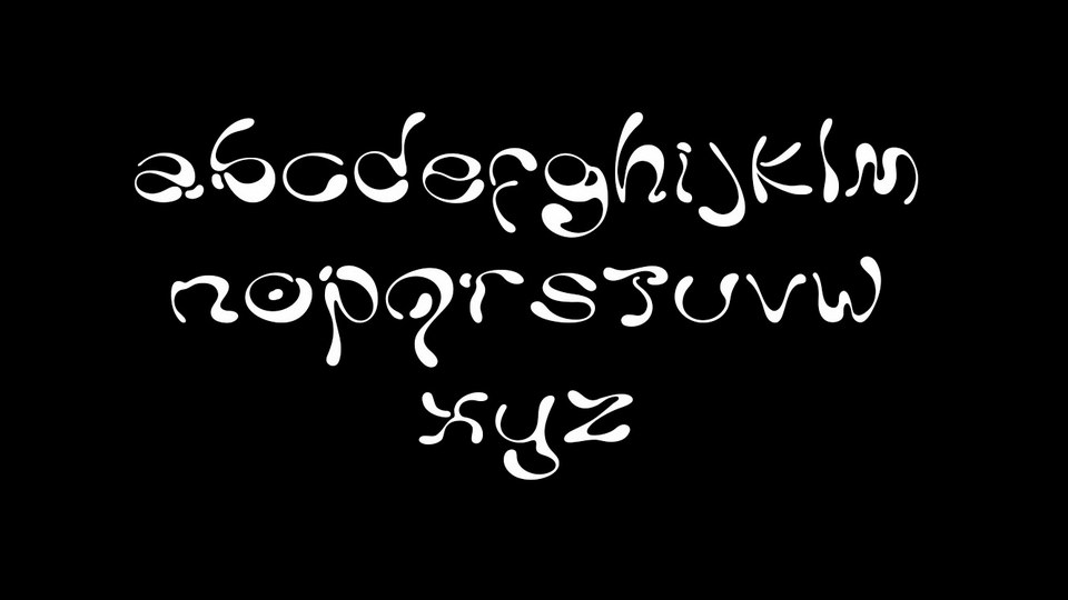


Introducing Ladi, an asymmetric typeface based on liquid forms, as to display a high contrast in its imbalance and uncertain curves. It’s name comes from the greek word λάδι meaning oil, as the viscous substance was the most recurring reference through the sketches of the glyphs, which were designed to translate fluidity, resembling a dense liquid suspended in constant movement. The form of each letter was an exercise and experiment on their own on how to trace individual paths for the eye, while also caring to shape the hollow spaces of the glyphs as attentively as the letters themselves.
Ladi font family is free for personal and commercial use.
Thanks to Milena Leimig for sharing the Ladi typeface. Don’t forget to appreciate this excellent project, support and follow the designer.